### 여러개의 클러스터링 갯수를 List로 입력 받아 각각의 실루엣 계수를 면적으로 시각화한 함수 작성
def visualize_silhouette(cluster_lists, X_features):

    from sklearn.datasets import make_blobs
    from sklearn.cluster import KMeans
    from sklearn.metrics import silhouette_samples, silhouette_score

    import matplotlib.pyplot as plt
    import matplotlib.cm as cm
    import math

    # 입력값으로 클러스터링 갯수들을 리스트로 받아서, 각 갯수별로 클러스터링을 적용하고 실루엣 개수를 구함
    n_cols = len(cluster_lists)

    # plt.subplots()으로 리스트에 기재된 클러스터링 수만큼의 sub figures를 가지는 axs 생성
    fig, axs = plt.subplots(figsize=(4*n_cols, 4), nrows=1, ncols=n_cols)

    # 리스트에 기재된 클러스터링 갯수들을 차례로 iteration 수행하면서 실루엣 개수 시각화
    for ind, n_cluster in enumerate(cluster_lists):

        # KMeans 클러스터링 수행하고, 실루엣 스코어와 개별 데이터의 실루엣 값 계산.
        clusterer = KMeans(n_clusters = n_cluster, max_iter=500, random_state=0)
        cluster_labels = clusterer.fit_predict(X_features)

        sil_avg = silhouette_score(X_features, cluster_labels)
        sil_values = silhouette_samples(X_features, cluster_labels)

        y_lower = 10
        axs[ind].set_title('Number of Cluster : '+ str(n_cluster)+'\n' \
                          'Silhouette Score :' + str(round(sil_avg,3)) )
        axs[ind].set_xlabel("The silhouette coefficient values")
        axs[ind].set_ylabel("Cluster label")
        axs[ind].set_xlim([-0.1, 1])
        axs[ind].set_ylim([0, len(X_features) + (n_cluster + 1) * 10])
        axs[ind].set_yticks([])  # Clear the yaxis labels / ticks
        axs[ind].set_xticks([0, 0.2, 0.4, 0.6, 0.8, 1])

        # 클러스터링 갯수별로 fill_betweenx( )형태의 막대 그래프 표현.
        for i in range(n_cluster):
            ith_cluster_sil_values = sil_values[cluster_labels==i]
            ith_cluster_sil_values.sort()

            size_cluster_i = ith_cluster_sil_values.shape[0]
            y_upper = y_lower + size_cluster_i

            color = cm.nipy_spectral(float(i) / n_cluster)
            axs[ind].fill_betweenx(np.arange(y_lower, y_upper), 0, ith_cluster_sil_values, \
                                facecolor=color, edgecolor=color, alpha=0.7)
            axs[ind].text(-0.05, y_lower + 0.5 * size_cluster_i, str(i))
            y_lower = y_upper + 10

        axs[ind].axvline(x=sil_avg, color="red", linestyle="--")
# make_blobs 을 통해 clustering 을 위한 4개의 클러스터 중심의 500개 2차원 데이터 셋 생성
from sklearn.datasets import make_blobs
X, y = make_blobs(n_samples=500, n_features=2, centers=4, cluster_std=1, \
center_box=(-10.0, 10.0), shuffle=True, random_state=1)
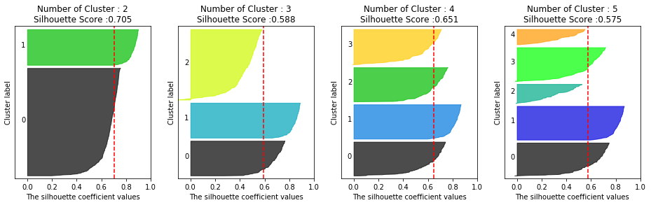
# cluster 개수를 2개, 3개, 4개, 5개 일때의 클러스터별 실루엣 계수 평균값을 시각화
visualize_silhouette([ 2, 3, 4, 5], X)
from sklearn.datasets import make_blobs
from sklearn.cluster import KMeans
from sklearn.metrics import silhouette_samples, silhouette_score
import matplotlib.pyplot as plt
import matplotlib.cm as cm
import numpy as np
print(__doc__)
# Generating the sample data from make_blobs
# This particular setting has one distinct cluster and 3 clusters placed close
# together.
X, y = make_blobs(n_samples=500,
n_features=2,
centers=4,
cluster_std=1,
center_box=(-10.0, 10.0),
shuffle=True,
random_state=1) # For reproducibility
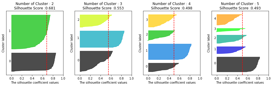
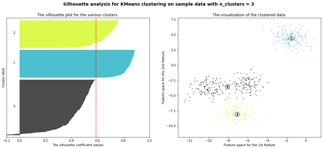
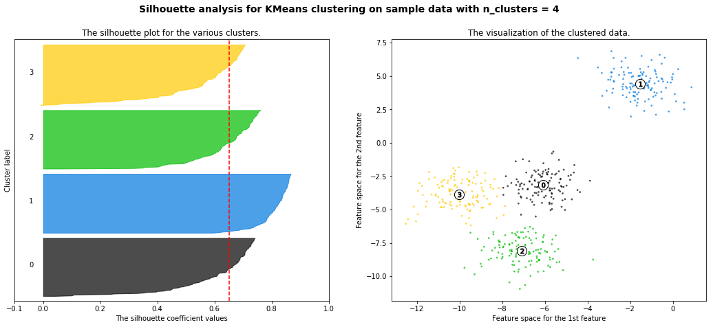
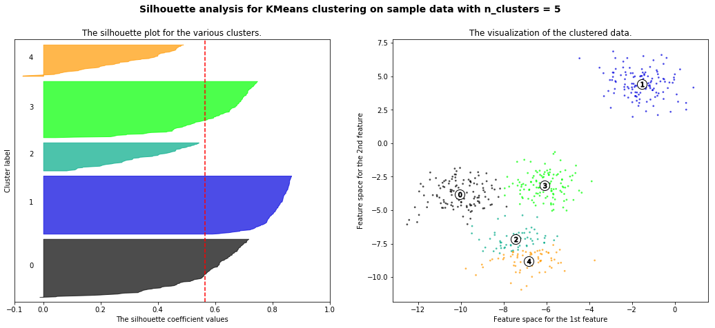
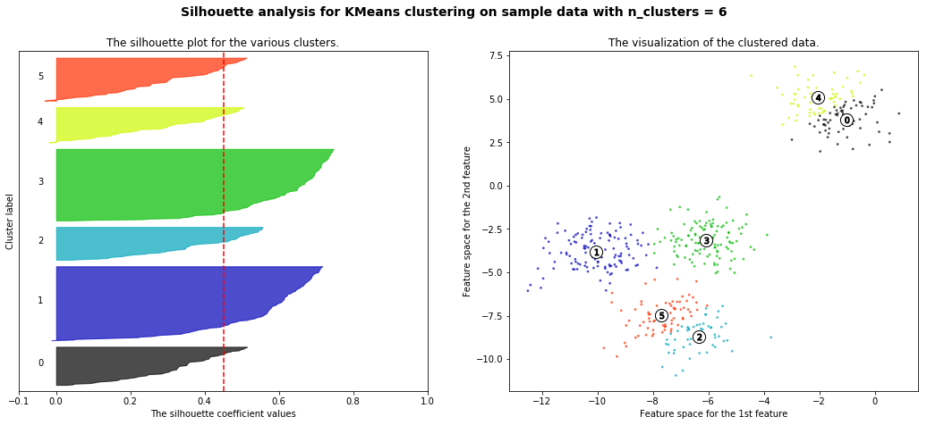
range_n_clusters = [2, 3, 4, 5, 6]
for n_clusters in range_n_clusters:
# Create a subplot with 1 row and 2 columns
fig, (ax1, ax2) = plt.subplots(1, 2)
fig.set_size_inches(18, 7)
# The 1st subplot is the silhouette plot
# The silhouette coefficient can range from -1, 1 but in this example all
# lie within [-0.1, 1]
ax1.set_xlim([-0.1, 1])
# The (n_clusters+1)*10 is for inserting blank space between silhouette
# plots of individual clusters, to demarcate them clearly.
ax1.set_ylim([0, len(X) + (n_clusters + 1) * 10])
# Initialize the clusterer with n_clusters value and a random generator
# seed of 10 for reproducibility.
clusterer = KMeans(n_clusters=n_clusters, random_state=10)
cluster_labels = clusterer.fit_predict(X)
# The silhouette_score gives the average value for all the samples.
# This gives a perspective into the density and separation of the formed
# clusters
silhouette_avg = silhouette_score(X, cluster_labels)
print("For n_clusters =", n_clusters,
"The average silhouette_score is :", silhouette_avg)
# Compute the silhouette scores for each sample
sample_silhouette_values = silhouette_samples(X, cluster_labels)
y_lower = 10
for i in range(n_clusters):
# Aggregate the silhouette scores for samples belonging to
# cluster i, and sort them
ith_cluster_silhouette_values = \
sample_silhouette_values[cluster_labels == i]
ith_cluster_silhouette_values.sort()
size_cluster_i = ith_cluster_silhouette_values.shape[0]
y_upper = y_lower + size_cluster_i
color = cm.nipy_spectral(float(i) / n_clusters)
ax1.fill_betweenx(np.arange(y_lower, y_upper),
0, ith_cluster_silhouette_values,
facecolor=color, edgecolor=color, alpha=0.7)
# Label the silhouette plots with their cluster numbers at the middle
ax1.text(-0.05, y_lower + 0.5 * size_cluster_i, str(i))
# Compute the new y_lower for next plot
y_lower = y_upper + 10 # 10 for the 0 samples
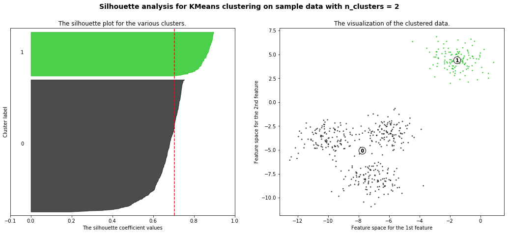
ax1.set_title("The silhouette plot for the various clusters.")
ax1.set_xlabel("The silhouette coefficient values")
ax1.set_ylabel("Cluster label")
# The vertical line for average silhouette score of all the values
ax1.axvline(x=silhouette_avg, color="red", linestyle="--")
ax1.set_yticks([]) # Clear the yaxis labels / ticks
ax1.set_xticks([-0.1, 0, 0.2, 0.4, 0.6, 0.8, 1])
# 2nd Plot showing the actual clusters formed
colors = cm.nipy_spectral(cluster_labels.astype(float) / n_clusters)
ax2.scatter(X[:, 0], X[:, 1], marker='.', s=30, lw=0, alpha=0.7,
c=colors, edgecolor='k')
# Labeling the clusters
centers = clusterer.cluster_centers_
# Draw white circles at cluster centers
ax2.scatter(centers[:, 0], centers[:, 1], marker='o',
c="white", alpha=1, s=200, edgecolor='k')
for i, c in enumerate(centers):
ax2.scatter(c[0], c[1], marker='$%d$' % i, alpha=1,
s=50, edgecolor='k')
ax2.set_title("The visualization of the clustered data.")
ax2.set_xlabel("Feature space for the 1st feature")
ax2.set_ylabel("Feature space for the 2nd feature")
plt.suptitle(("Silhouette analysis for KMeans clustering on sample data "
"with n_clusters = %d" % n_clusters),
fontsize=14, fontweight='bold')
plt.show()
Automatically created module for IPython interactive environment
For n_clusters = 2 The average silhouette_score is : 0.7049787496083262
For n_clusters = 3 The average silhouette_score is : 0.5882004012129721
For n_clusters = 4 The average silhouette_score is : 0.6505186632729437
For n_clusters = 5 The average silhouette_score is : 0.56376469026194
For n_clusters = 6 The average silhouette_score is : 0.4504666294372765
import numpy as np
import matplotlib.pyplot as plt
from sklearn.cluster import KMeans
from sklearn.datasets import make_blobs
%matplotlib inline

X, y = make_blobs(n_samples=200, n_features=2, centers=3, cluster_std=0.8, random_state=0)
print(X.shape, y.shape)

# y target 값의 분포를 확인
unique, counts = np.unique(y, return_counts=True)
print(unique,counts) # centers 갯수만큼 나옴


# (200, 2) (200,)
# [0 1 2] [67 67 66]
n_samples: 생성할 총 데이터의 개수입니다. 디폴트는 100개입니다.
n_features: 데이터의 피처 개수입니다. 시각화를 목표로 할 경우 2개로 설정해 보통 첫 번째 피처는 x 좌표, 두 번째 피처 는 y 좌표상에 표현합니다.
centers: int 값, 예를 들어 3으로 설정하면 군집의 개수를 나타냅니다. 그렇지 않고 ndarray 형태로 표현할 경우 개별 군 집 중심점의 좌표를 의미합니다.
cluster_std: 생성될 군집 데이터의 표준 편차를 의미합니다. 만일 float 값 0.8과 같은 형태로 지정하면 군집 내에서 데이 터가 표준편차 0.8을 가진 값으로 만들어집니다. [0.8, 1,2, 0.6]과 같은 형태로 표현되면 3개의 군집에서 첫 번째 군집 내 데이터의 표준편차는 0.8, 두 번째 군집 내 데이터의 표준 편차는 1.2, 세 번째 군집 내 데이터의 표준편차는 0.6으로 만듭 니다. 군집별로 서로 다른 표준 편차를 가진 데이터 세트를 만들 때 사용합니다
from sklearn.decomposition import TruncatedSVD, PCA
from sklearn.datasets import load_iris
import matplotlib.pyplot as plt
%matplotlib inline
iris = load_iris()
iris_ftrs = iris.data
# 2개의 주요 component로 TruncatedSVD 변환
tsvd = TruncatedSVD(n_components=2)
tsvd.fit(iris_ftrs)
iris_tsvd = tsvd.transform(iris_ftrs)
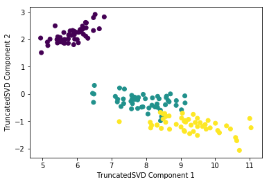
# Scatter plot 2차원으로 TruncatedSVD 변환 된 데이터 표현. 품종은 색깔로 구분
plt.scatter(x=iris_tsvd[:,0], y= iris_tsvd[:,1], c= iris.target)
plt.xlabel('TruncatedSVD Component 1')
plt.ylabel('TruncatedSVD Component 2')
# Text(0,0.5,'TruncatedSVD Component 2')
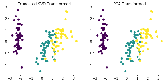
from sklearn.preprocessing import StandardScaler

# iris 데이터를 StandardScaler로 변환
scaler = StandardScaler()
iris_scaled = scaler.fit_transform(iris_ftrs)

# 스케일링된 데이터를 기반으로 TruncatedSVD 변환 수행
tsvd = TruncatedSVD(n_components=2)
tsvd.fit(iris_scaled)
iris_tsvd = tsvd.transform(iris_scaled)

# 스케일링된 데이터를 기반으로 PCA 변환 수행
pca = PCA(n_components=2)
pca.fit(iris_scaled)
iris_pca = pca.transform(iris_scaled)

# TruncatedSVD 변환 데이터를 왼쪽에, PCA변환 데이터를 오른쪽에 표현
fig, (ax1, ax2) = plt.subplots(figsize=(9,4), ncols=2)
ax1.scatter(x=iris_tsvd[:,0], y= iris_tsvd[:,1], c= iris.target)
ax2.scatter(x=iris_pca[:,0], y= iris_pca[:,1], c= iris.target)
ax1.set_title('Truncated SVD Transformed')
ax2.set_title('PCA Transformed')

# Text(0.5,1,'PCA Transformed')
import seaborn as sns
import matplotlib.pyplot as plt
%matplotlib inline

corr = X_features.corr()
plt.figure(figsize=(14,14))
sns.heatmap(corr, annot=True, fmt='.1g')
상관도가 높은 피처들의 PCA 변환 후 변동성 확인
from sklearn.decomposition import PCA
from sklearn.preprocessing import StandardScaler

#BILL_AMT1 ~ BILL_AMT6까지 6개의 속성명 생성
cols_bill = ['BILL_AMT'+str(i) for i in range(1, 7)]
print('대상 속성명:', cols_bill)

# 2개의 PCA 속성을 가진 PCA 객체 생성하고, explained_variance_ratio_ 계산을 위해 fit( ) 호출
scaler = StandardScaler()
df_cols_scaled = scaler.fit_transform(X_features[cols_bill])
pca = PCA(n_components=2)
pca.fit(df_cols_scaled)

print('PCA Component별 변동성:', pca.explained_variance_ratio_)

# 대상 속성명: ['BILL_AMT1', 'BILL_AMT2', 'BILL_AMT3', 'BILL_AMT4', 'BILL_AMT5', 'BILL_AMT6']
# PCA Component별 변동성: [0.90555253 0.0509867 ]
원본 데이터 세트와 6개 컴포넌트로 PCA 변환된 데이터 세트로 분류 예측 성능 비교
import numpy as np
from sklearn.ensemble import RandomForestClassifier
from sklearn.model_selection import cross_val_score

rcf = RandomForestClassifier(n_estimators=300, random_state=156)
scores = cross_val_score(rcf, X_features, y_target, scoring='accuracy', cv=3 )

print('CV=3 인 경우의 개별 Fold세트별 정확도:',scores)
print('평균 정확도:{0:.4f}'.format(np.mean(scores)))


CV=3 인 경우의 개별 Fold세트별 정확도: [0.8083 0.8196 0.8232]
평균 정확도:0.8170
from sklearn.decomposition import PCA
from sklearn.preprocessing import StandardScaler

# 원본 데이터셋에 먼저 StandardScaler적용
scaler = StandardScaler()
df_scaled = scaler.fit_transform(X_features)

# 6개의 Component를 가진 PCA 변환을 수행하고 cross_val_score( )로 분류 예측 수행.
pca = PCA(n_components=6)
df_pca = pca.fit_transform(df_scaled)
scores_pca = cross_val_score(rcf, df_pca, y_target, scoring='accuracy', cv=3)

print('CV=3 인 경우의 PCA 변환된 개별 Fold세트별 정확도:',scores_pca)
print('PCA 변환 데이터 셋 평균 정확도:{0:.4f}'.format(np.mean(scores_pca)))


CV=3 인 경우의 PCA 변환된 개별 Fold세트별 정확도: [0.7919 0.7956 0.8025]
PCA 변환 데이터 셋 평균 정확도:0.7967